

Most people open an AI visual tool and start by asking the wrong question.
They ask:
“What prompt should I use?”
A better question is:
“What am I trying to make the viewer see, feel, and understand?”
That small shift changes everything.
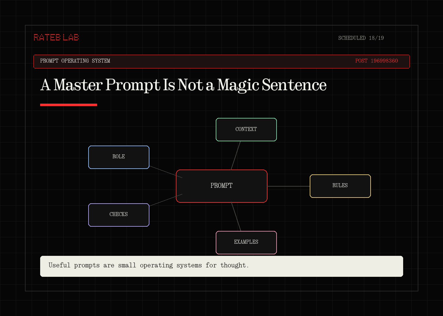
Because a good prompt is not a magic sentence.
It is a thinking system.
It is a small creative brief.
It tells the model what the asset is for, what should appear, how it should feel, how the camera should see it, how the light should shape it, and what mistakes to avoid.
This matters more now because tools like Higgsfield, Midjourney, Runway, Kling, and Sora are getting stronger.
The better the tools become, the more your taste and direction matter.
The tool can generate.
But you still have to direct.
The simple problem
Most beginner prompts look like this:
Make a cinematic video of a luxury watch in a futuristic city.
That can work by luck.
But it gives the model too much freedom.
What kind of luxury?
What kind of city?
What camera angle?
What lighting?
Is this a product ad, a social post, a brand film, or a concept test?
What should the viewer notice first?
What should be avoided?
The prompt is not bad because it is short.
It is bad because it does not make decisions.
First principle: the prompt is the last step
The prompt should not be the first thing you write.
The prompt should be the result of your thinking.
Before the prompt, you need five simple answers:
What is the visual supposed to do?
What is the main subject?
What should the viewer feel?
What visual choices create that feeling?
What should the model avoid?
That is the base of the Master Prompt OS.
The Master Prompt OS
Use this five-step system:
Intent
Subject
Direction
Prompt
Diagnosis
It works for images.
It works for video.
It works for product shots, fashion editorials, architecture renders, cinematic ads, and social visuals.
The platform can change.
The thinking system stays the same.
Step 1: Intent
Intent means the job of the visual.
Do not start with style.
Start with the job.
Ask:
Is this a hook image?
Is this a product ad?
Is this a portfolio piece?
Is this a character reference?
Is this a brand visual?
Is this a video opener?
Is this a proof image that needs realism?
An image for a landing page is not the same as an image for a TikTok hook.
A product shot is not the same as a surreal concept.
A cinematic reel opener is not the same as a clean LinkedIn diagram.
The model needs to know the job.
Simple example:
Create a 9:16 video opener for a fitness brand ad. The goal is to make the viewer feel speed, discipline, and premium energy in the first two seconds.
Now the tool has a job.
Step 2: Subject
The subject is what the viewer must understand first.
This is where many prompts fail.
They describe a whole world, but the main thing gets lost.
Ask:
Who or what is the hero?
What is the viewer supposed to notice first?
Is there one subject or many?
Should the subject be close, wide, centered, moving, still, isolated, or surrounded?
If the subject is unclear, the image will feel messy.
Better:
A single black running shoe, centered, floating above wet asphalt, with water droplets frozen around it.
Worse:
A cool sports product ad with rain and energy.
The first prompt gives the model a subject.
The second gives it a mood and hopes for the best.
Step 3: Direction
Direction is where taste becomes visible.
Do not write “premium” and stop there.
Translate premium into visual choices.
Premium might mean:
clean negative space
soft studio light
controlled reflections
simple background
high material detail
slow camera movement
restrained color palette
Cinematic might mean:
low-angle camera
shallow depth of field
strong contrast
atmospheric haze
warm practical light
slow push-in
film-like color grade
Energetic might mean:
diagonal composition
motion blur
flash photography
athlete mid-action
particles, water, dust, or fabric movement
sharp contrast
This is the key.
The model does not understand your taste until you turn it into visible decisions.
Step 4: Prompt
Now you can write the prompt.
Use this structure:
[Asset role] of [main subject] for [audience/use case].
Scene: [specific context, action, environment].
Visual direction: [style category], [mood], [brand world], [narrative].
Composition: [shot type], [camera angle], [lens], [framing], [negative space].
Lighting: [source], [direction], [softness/hardness], [contrast], [time/temperature].
Material detail: [surfaces, texture, tactile cues, realism priorities].
Color system: [palette], [accent], [saturation], [grade].
Motion or moment: [pose/action/camera movement/timing] if relevant.
Technical constraints: [aspect ratio, duration, resolution, platform].
Avoid: [distortions, extra objects, wrong mood, text/logo issues, identity drift].
That looks long, but it is not complicated.
Each line answers one simple question.
What is it?
Where is it?
How should it feel?
How is the camera seeing it?
How is it lit?
What materials matter?
What colors matter?
What moves?
What are the limits?
What should not happen?
Step 5: Diagnosis
This is the part most people skip.
They generate a bad result and write a new random prompt.
That teaches you nothing.
Instead, diagnose the output.
Ask:
Was the subject clear?
Was the composition strong?
Did the lighting create the right mood?
Did the material look real?
Did the style feel specific or generic?
Did the output fit the platform?
What one thing should change next?
If the result is beautiful but wrong, fix the intent.
If the result is correct but boring, fix the lighting, camera, or composition.
If the style feels generic, fix the visual DNA.
If the product is distorted, simplify the scene.
If a video morphs, reduce the motion and shorten the shot.
Do not change ten things at once.
Change one layer.
Then test again.
Alpha Prompt vs Master Prompt
A lot of people try to write the perfect prompt immediately.
That is the wrong goal.
Start with an Alpha Prompt.
An Alpha Prompt is your first structured attempt.
Its job is exploration.
Then you generate a small test grid.
You look at what worked.
You fix what failed.
Then you turn the best direction into a Master Prompt.
A Master Prompt is not just longer.
It is more controlled.
It has decisions.
It has reusable parts.
It has constraints.
It can create variations without losing the original idea.
Example: from vague idea to master prompt
Vague idea:
I want a cool visual for a coffee brand.
First-principles brief:
A premium 9:16 social ad opener for a small coffee brand. The viewer should feel warmth, craft, and morning focus. The main subject is a ceramic cup with espresso being poured. The visual should feel calm, tactile, and high quality.
Alpha Prompt:
9:16 cinematic video opener for a premium coffee brand. A ceramic cup sits on a dark wooden table as fresh espresso pours into it. Warm morning light enters from the side, soft steam rising, shallow depth of field, close-up macro feel, calm premium mood, tactile ceramic and wood texture, warm brown and cream color palette, slow push-in camera movement, clean composition, no text, no logo, no extra cups, no messy background.Diagnosis after generation:
If it feels too generic, add a more specific setting.
If the cup warps, simplify the scene.
If the coffee pour looks fake, reduce motion or use image-to-video from a strong still.
If the mood is not premium, reduce props and strengthen lighting.
Master Prompt:
9:16 premium coffee brand video opener for a calm morning-focus campaign.
Scene: one matte ceramic espresso cup on a dark walnut table, fresh espresso pouring in a thin stream, soft steam rising.
Visual direction: warm, minimal, handcrafted, premium, tactile, slow-living mood.
Composition: close-up macro product shot, cup centered slightly below frame middle, shallow depth of field, clean negative space above cup.
Lighting: warm side window light from camera left, soft shadows, gentle highlights on ceramic rim, natural morning atmosphere.
Material detail: matte ceramic texture, glossy espresso surface, walnut grain, visible steam, realistic liquid movement.
Color system: deep brown, cream, warm amber highlights, low saturation, soft contrast.
Motion: slow push-in camera, espresso stream steady, steam drifting naturally, 4-6 seconds.
Technical constraints: vertical 9:16, high realism, social ad opener.
Avoid: text, logo, extra cups, warped cup shape, messy background, oversaturated orange color, unrealistic liquid splash.
Now the tool has direction.
Not just words.
Direction.
The shortcut
If the full structure feels too much, use this:
Create [asset type] of [subject] for [use case].
Make it feel [emotion] by using [camera], [lighting], [composition], [materials], and [color].
Keep [important constraint].
Avoid [main failure].
Example:
Create a 9:16 video opener of a black running shoe for a premium fitness ad.
Make it feel fast, disciplined, and cinematic by using a low-angle close-up, hard flash lighting, wet asphalt, frozen water droplets, and a black/white/red color palette.
Keep the shoe shape accurate and dominant in the frame.
Avoid extra shoes, warped logos, messy backgrounds, and unrealistic foot anatomy.
That is enough for many tools.
The point is not complexity.
The point is clarity.
Why this works
AI visual tools are not only prompt machines.
They are direction machines.
They respond better when you give them:
a job
a subject
a visual language
a camera
a lighting plan
material detail
color direction
constraints
a refinement loop
This is why collecting prompts is not enough.
You need to understand why a prompt works.
Once you see the structure, you can build your own.
For any product.
For any brand.
For any platform.
For any AI visual tool.
A simple practice
Try this the next time you use Higgsfield or any visual AI platform:
Write your idea in one sentence.
Write the job of the visual.
Name the main subject.
Choose one emotion.
Choose camera, lighting, composition, material, and color.
Write an Alpha Prompt.
Generate 4 versions.
Diagnose one failure.
Change one layer.
Save the best version as your Master Prompt.
That is the whole system.
Simple enough to use.
Strong enough to repeat.
Tools mentioned
Final thought
Prompting is not about sounding advanced.
It is about making clear decisions.
The better your thinking, the better your prompt.
The better your prompt, the easier it becomes to generate visuals that actually match the idea in your head.
That is the real skill.